A 'gentle' introduction to multiple linear regression
- Andrea Osika
- Oct 23, 2020
- 7 min read

For anyone who doesn't know what linear regression is, it's a modeling technique used to illustrate how a dependent variable relates to independent variables. If you ever get confused about dependent and independent variables, use this sentence as I do to navigate:
"(Independent variable) causes a change in (Dependent Variable) and it isn't possible that (Dependent Variable) could cause a change in (Independent Variable)."
A simple linear regression uses linear predictor functions using the dependent variable or X and data collected from an independent variable, or a multiple variables in the case of a multiple linear regression to predict what Y would be using the following equation:
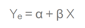
Our goal is to find statistically significant values of the parameters α andβ that minimize the difference between Y and Yₑ.
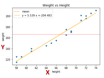
In the graph below, you can see that just taking the average or mean makes a lousy fit for predicting what Y would be. The orange line, however, depicts the prediction or 'best fit' for how the two variables relate to each other. The reason it's the best fit is that the distance from the blue dots (actual values) to the line is as small as it can be. This difference is called the variance. In the case of the graph below, the variance is used to explain how much of the change in weight can be explained by the change in height.
To calculate the total variance, you would subtract the average actual value from each of the actual values, square the results, and add them all together. From there, divide the first sum of errors (explained variance) by the second sum (total variance), subtract the result from one, and you have the R-squared. A value of 1 shows a perfect correlation, a value of 0 shows NONE.
Most real-world scenarios apply to the multiple variable case - think about how many factors impact one single factor. The idea is a straight, predictive line that illustrates how all these factors affect the single, dependent variable... hence the term 'linear'.
We should probably talk about assumptions for linear regression:
1) Linear relationship: The linearity assumptions require that there is a linear relationship between the response variable (Y) and predictor (X). Linear means that the change in Y by 1-unit change in X, is constant. Think orange line from the plot above. That makes sense, right?
2) No Mulitcollinarity - Since you are trying to predict the effect of the independent variables on the dependent variable - if they are correlated, it's bad. If the independent variables are correlated, it means that changes within one variable shift the other. It becomes difficult for the model to clearly estimate the relationship between each variable and the dependent variable independently because the variables change in unison. See how that's a problem?
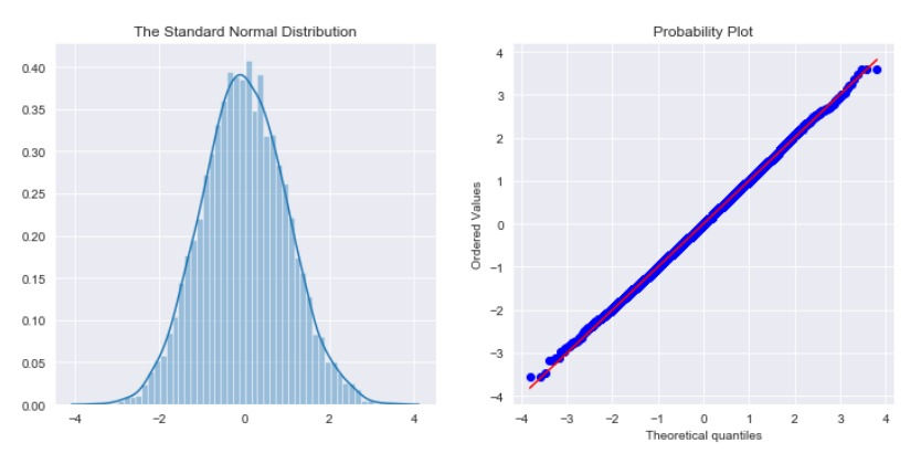
3) Normal Distribution - The difference between the predicted line and the actual data points needs to be normally distributed. It helps to have normally distributed data going in to the predictive model. You can normalize data if it's not normal - but only if you have to.
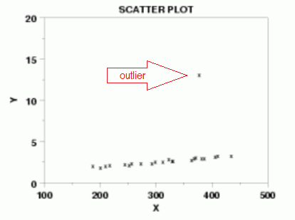
This means that there are no outliers: since a linear relationship should exist it means there are no wild cards that could skew the line one way to the left or right. Think if we tried to draw a line through the middle of that data. That one little outlier would drag the line upwards and to the left - a lot.
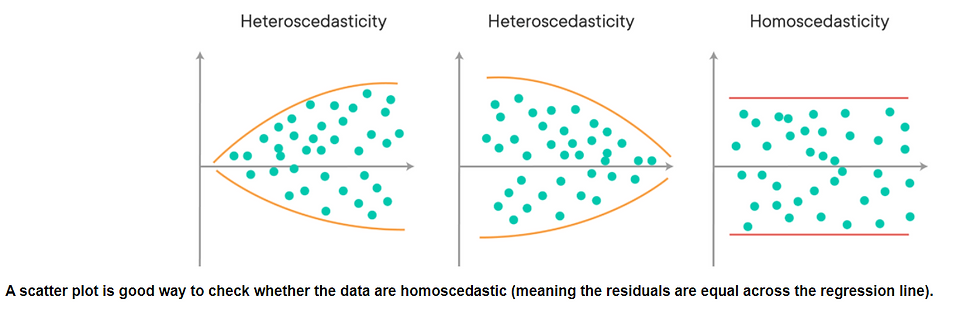
The easiest way to check for normal distribution is looking... Here are two very common tools to look at distribution. A histogram and a QQ plot. See how perfectly balanced they are?
4) Homoskedacity - There shouldn't be any sort of pattern in the residuals. If you were to plot them:
You still here? Cool. Wanna apply it?
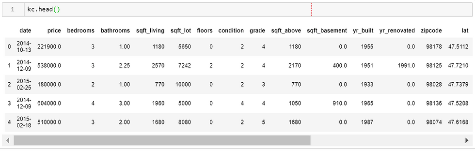
I think everyone who's studied data has looked at the King County dataset at some point. I'm making sure everyone feels included here, so you aren't familiar: It contains 21 features and captures geographic, financial, and housing specific data (think sq ft, lot size, bedrooms). It's perfect for a multiple linear regression model example and offers categorical, numeric, and time-series data types that all affect the single dependent variable in this case: price.
Once we load our dataset, we examine it to discover more about each column. What we are looking for is the basics, duplicates, null values, unique values. Wonky data in equals wonky results (wonky is code for inaccurate). So dealing with these upfront helps make our model more accurate. Once we've dealt with reconciling all these items (data cleaning is a topic of it's own).
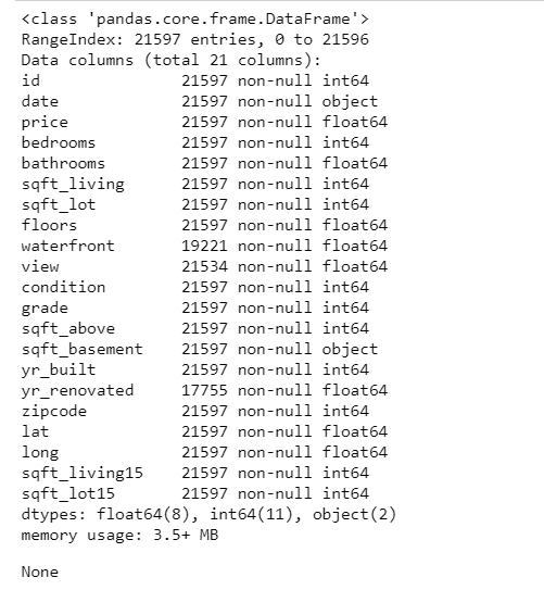
It's important to also look at the data types. Numeric data is the easiest to manage here you can see numeric data represented as int64 or float64. Objects are hard for computers and algorithms to understand. They need to be transformed to numeric or date-time or the appropriate type needed to understand. Computers understand numbers... They don't understand gender, hair color so you can assign numbers to represent each categorical value. There are a couple of ways you can do this. Label encoding (assigning a number to each of the categories) , one-hot encoding (Turn each category in a categorical variable into its own variable, that is either a 0 or 1. 0 for rows that do not belong to that sub-category. 1 for rows that belong to the sub-category). There are many packages that support either one in Pandas or from scikit-learn.
For the most part for me, I was able to just apply a category code in Pandas. Grade is a numeric value assigned based on several factors around construction and design. Even though it's numeric I consider it to be categorical since it's not an exact measurement:
cat_grade = kc['grade'].astype('category')
coded_grade = cat_grade.cat.codes
kc['grade'] = coded_grade
Once all my categories are assigned I start checking the list on assumptions.
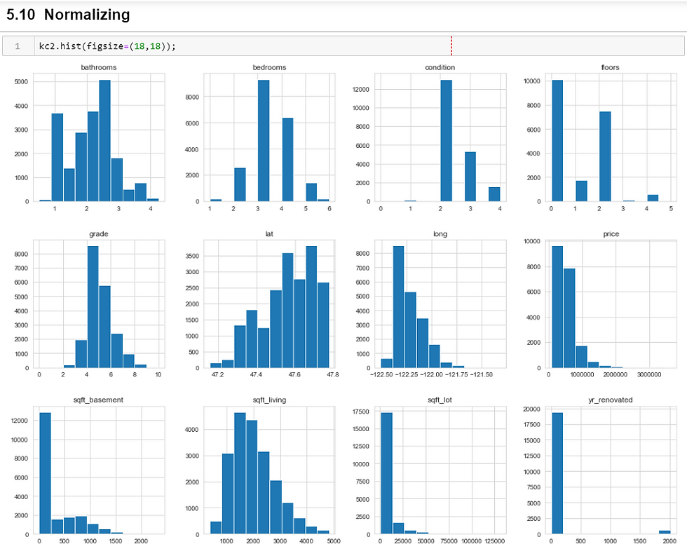
Ok, so nothing was really normal except grade. Looking at all of these, it's overwhelming. I tried to keep most of these as they were to represent the data as purely as possible. I log-transformed square feet to help normalize it. There is a lot of trial and error that happens during this process. In case I had to add more to the list of normalizing, I created a variable and went to work:
log_cols = ['sqft_living']

for col in log_cols:
    kc2[col+ '_log'] = np.log(kc2[col])
Correlations were the next thing to dig into. Pandas has a feature that helps out with this. I'm a visual person, so I wanted a peek at what was correlated:
corr = kc2.corr().round(3)

#checking visually:
def multiplot(corr, figsize=(16,16)):
    fig, ax = plt.subplots(figsize=figsize)

    mask = np.zeros_like(corr, dtype=np.bool)
    idx = np.triu_indices_from(mask)
    mask[idx] = True

    sns.heatmap(np.abs(corr),square=True, mask=mask, annot=True, cmap='Reds', ax=ax)
    return fig, ax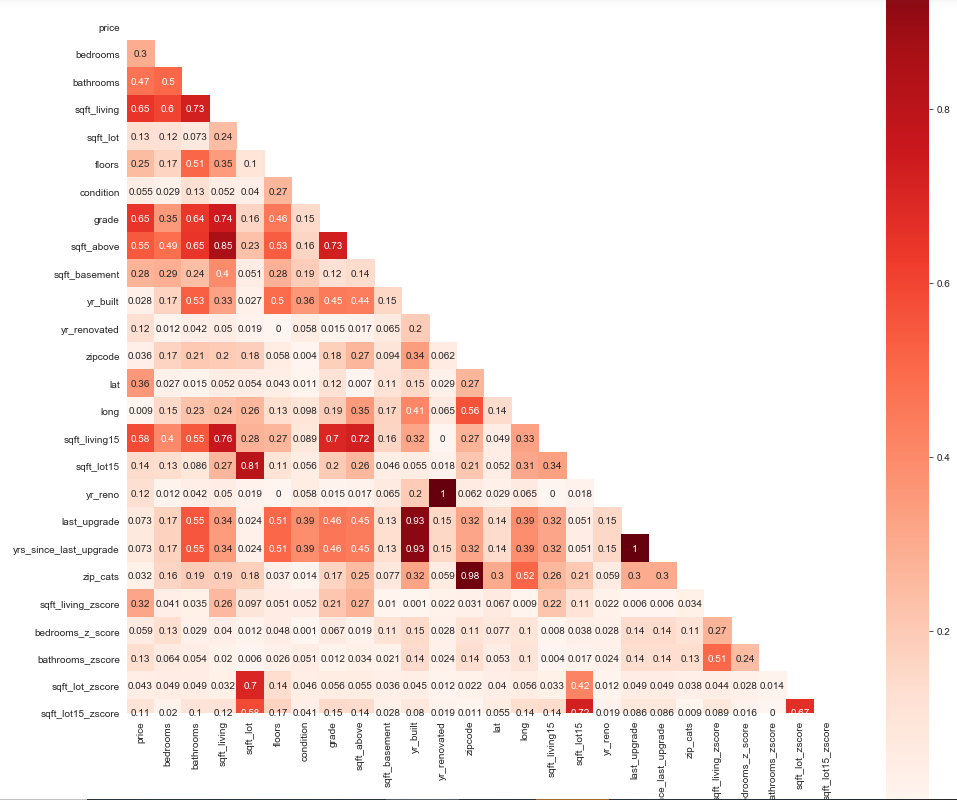
This visual provided some insight as to which features were highly correlated and should/could be dropped. Clearly anything that was above 90 is low-hanging fruit. At the same time, you don't want to remove too much.
Here's the features I kept out of the initial 21 after running my baseline model and determining that a couple features were not additive based on their P-value:
Bedrooms, bathrooms, floors, condition, grade, zipcode, lat, long, yrs_since_last_upgrade, and sqft_living_log <- the log-transformed version of liveable square feet.
There are many ways you can do a linear regression, but luckily statsmodels API provides all the tools a girl could ask for:
# Importing necessary tools
import statsmodels.api as sm
import statsmodels.stats.api as sms
import statsmodels.formula.api as smf
Here I drop the target(price), targeted correlated fields as well as the non-log-transformed sqft_living:
#building calling the appropriate columns to build model with:
cols = kc2.drop(['price', 'sqft_basement', 'sqft_lot', 'sqft_living'], axis=1).columns
str_cols = '  + '.join(cols)
str_cols
and build a formula:
formula = 'price~' + str_cols
formula
and then the model:
model = smf.ols(formula=formula, data=kc2).fit()
model.summary()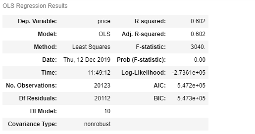
There is a lot to take in here, but mainly we can focus on what I'd talked about before, the R-Squared value. Here you can see that 60% of the variables in this model explain price. If you want to get into the rest of the details, you can read this article that sums it all up here. I looked also at homoscedasticity and a QQ plot to see now normally distributed the residuals were:
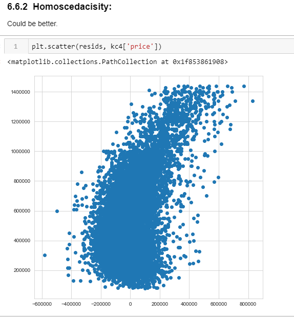
NOT very homoscedastic!
Yikes.
To make a qq plot use matplotlib (mpl) and statsmodels (sm):
resids = model.resid
import scipy.stats as stats

mpl.rcParams['figure.figsize'] = (8,8)
sm.graphics.qqplot(resids, stats.norm, line = '45', fit=True)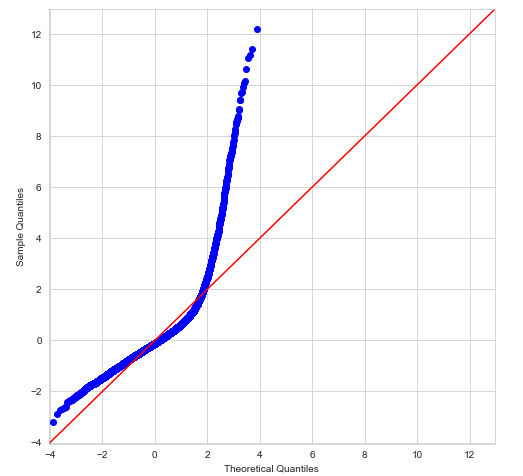
Did not look like it was very normal. AT ALL. I had work to do. So back to the drawing board. I repeated the process and examined my data carefully. I noticed that there were some outliers that could be removed ... including my target. I also ended up standardizing my data. Basically, this is a way to equalize things - compare apples to apples. It makes all features are center around 0 and have variance in the same order. I got better results:
You can see here how the tools help to visualize how well your model can perform. I mentioned before that it's trial and error to see what works and what doesn't. I could bore you more with details, but I've done enough damage as it is!
A lot of back and forth and head-scratching lead me here. I took a shortcut here and categorized zip code when building my formula:
str3 = 'C(zipcode) + bedrooms_sca + bathrooms_sca + sqft_lot_sca + floors_sca + condition_sca + grade_sca + yrs_since_last_upgrade_sca + sqft_living_log_sca'

formula = 'price~' + str3
You can see by now I'm on my 4th version of the original dataset named 'kc4'.
model = smf.ols(formula=formula, data=kc4).fit()
model.summary()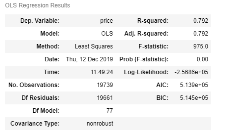
Again, we could go a lot deeper, but this is a 'gentle' introduction, so focusing on the R-Squared. Basically, we got a 19% increase. Not bad, 'eh?
Based on this model, 79.2% of a price could be predicted by the features included. We could look at the coefficients and more detail and methodically improve the model, but for now, we'll just know that in general was pretty good for predicting a home price.
You can see the project here if you want to dig a little more.


Comments