K-Means what? A technical non-technical explanation of K-Means clustering.
- Andrea Osika
- Apr 9, 2021
- 5 min read

Updated: Apr 12, 2021

I’ve used cluster analysis for a couple of projects. For me, it's never been used to solve a classification problem completely but has been very useful as an analysis tool. This is probably because it's an unsupervised learning algorithm. I've mentioned this a lot in these posts: I'm very visual. Dividing things up based on how they fall into groups organically makes sense to me in terms of how to organize something. When looking for trends, it’s nice to be able to see patterns visually. K-Means is mathematical but can be visualized to help identify patterns. I talk about it in this post on a high level. But how does the algorithm work? Can I explain it to a non-technical audience without a ton of math that repels most people? Let me give it a shot.
As I mentioned, K-Means is considered unsupervised. This means we don't have labels or ideas of exactly how we'll group things. It can come in handy for analysis which is where I tend to spend a lot of time because I like to understand my data and full disclosure: I like the analysis.
So what does it do exactly? It groups things.
K-Means gets its name from creating 'k' number of clusters based on their common mean. The goal is to divide ‘n’ number of observations into these clusters. The closer the data points are to the center of the cluster, the more likely it is to belong to that cluster.
This happens in two steps that repeat until the values in the second step of the process do not change. The math behind it usually makes people's eyes glaze over, but since this is technically non-technical we'll keep it light. If you want to 'go there', you can visit here or here to read more, and I'll spare the gory details for now. Just in case you were a tiny bit curious or feel like I'm being dramatic, here's the math behind the two steps it takes (eyes can glaze in 3, 2, 1....)
I'll explain below steps 1 and 2 in English:
1. The assignment step:
Clusters are formed by randomly assigning each observation to a cluster, and a center point is created for each based on having the nearest (smallest) mean.
I’ll simplify it even more: Imagine drawing straight lines from the center point of each cluster to each datapoint, finding the distance to each point, and squaring this value. Add all these up and divide that total by the number of observations. We're looking for the smallest values since this would mean they are closest to the center point - and part of the group.
2. The update step:
The center point is recalculated for the observations and assigned to each cluster based on finding the smallest mean for each group.
This value updates over and over again and finds groups that have comparable relations. When the assignments quit changing, these clusters are considered final. This is called convergence. You have clusters that have mathematic relevance.
So now what?
It takes some interpretation skills and understanding of your data to make decisions about clusters. The toughest part in my humble opinion is to decide how many clusters. There are cases when the clusters are obvious with nicely defined boundaries or edges. Sometimes these edges are blurred, and we need help with determining how many clusters to create. I talk about one methodology here: where I use a slightly different algorithm called K-nearest neighbors and a more detailed methodology that decomposes each cluster into principal components or pieces that most likely explain each cluster. See how deep we can get? Keeping this light.
Back to the most basic and common way to determine how many clusters to create: Trial and error. Basically, we try a range of values for the number of clusters and evaluate the performance based on the sum of squared errors. Remember we want a small value for these. We can plot these to identify where the smallest value begins to level off. This is called an elbow plot. Even using an elbow plot to validate the number of clusters can give you varied outcomes each time you run it. The project shown below was a large dataset. Trying various numbers of clusters and evaluating the outcomes took two and a half hours to run this test. The black dotted line in the plot below makes the optimal number of clusters obvious. In analysis, it's important to cross-validate outcomes, so I ran the test multiple times. I consistently got five or six. I tested both. This brings me back to my point.

It takes some interpretation skills and probably understanding your data to make better decisions and refine it. For the case above, I more closely examined the data and determined that six clusters ultimately made better decisions. As I mentioned, this wasn't the algorithm that ultimately classified my data, but using this analysis I was able to further model it using a Support Vector Machine and Latent Dirichlet Allocation to find the trends I was looking for in the most consumable way possible which is always my main objective in analysis. Check it out here.
For many, this gets computationally expensive, eats time, and can be overwhelming when all we need is a quick overview. I've been using Tableau more frequently for exploratory data analysis. It's the first part where you're gaining understanding and identifying possible underlying trends. I've found that Tableau is really easy to use, can quickly slice through mountains of data, it's visual and interactive. It also offers K-Means analysis that does the optimizations rather quickly.
So really... What can cluster analysis tell you?
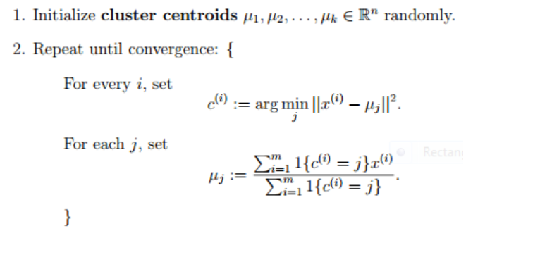
For this next example, I'm using a dataset that had some revenue and marketing spend data for a national service offering. I plotted these as a scatter plot in Tableau. Tableau is a GUI interface, so rather than coding - I simply click and drag the two variables to the x and y-axis. This actually gave me one data point in the upper right-hand corner since it was aggregated (summed totals) data. To gain a little more granularity, I dragged store ID to the details section then had my scatter plot. Where I saw at least two main clusters. Do you see them?

There are a few that look like they could belong to either the blue or the orange cluster. In Tableau, there's a tab that quickly analyses using the K-Means algorithm. It automatically creates clusters. However, if you want to explore more, you can modify how many you want.

Here, you can see the algorithm classifies them into cluster two. You can try various numbers to see if trends are revealed.
Based on this simple visual, to me, it's clear that those that are in cluster two yield a lower return on investment. That those falling into the blue cluster seem to yield a higher return on investment.
Next, we can examine if there are trends within the cluster that might inform where to invest to maximize our marketing spend. By applying highlighters, we can quickly visually examine to see if trends exist in being a new or old store if there are regional trends... and even state trends:
New stores seem to be a good investment:
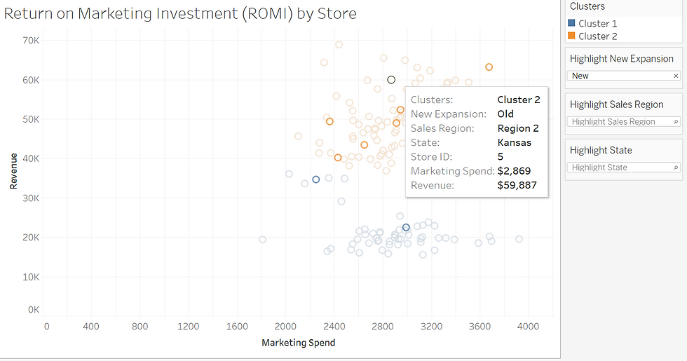
The region doesn't seem to make a difference. You see where Region 2 is selected (right-hand side of the worksheet) and observations occur in both clusters.
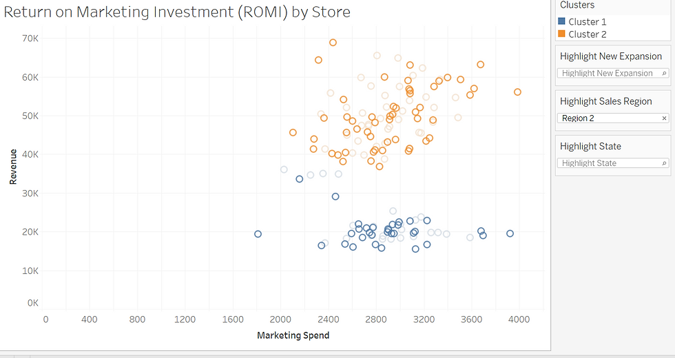
And Alabama seems to be a good place to invest in marketing since all of its observations belong to the high-yield cluster.
This unsupervised learning can provide some decent insight to help guide decision-making. It can be delivered in various formats. I've tried several. For quick analysis, Tableau offers a powerful speedy result. Perhaps now you understand a little of what's going on under the hood and are more likely to use it.
If you're interested in the interactive version of this, you can visit my Tableau Public Profile.
Drop me a line to let me know how you think you'd use it or ask a question!


Comments