OSEMN is Awesome... and it keeps you on track
- Andrea Osika
- Apr 16, 2021
- 6 min read

When taking on a new analysis project, it can be overwhelming. Many times you're analyzing data that you might not be a subject matter expert on. Since data comes in all shapes and sizes, it can be in various formats, or incomplete, or have missing values, and can be hard to understand in general. When studying analytics and data science I learned a tool to stay on track and it's come in handy to keep me focused at the task at hand: OSEMN. It's an acronym. It stands for
Obtain
Scrub
Examine
Model
iNterpret
Obtaining data
It can be one of the most challenging parts. In past projects, I've extracted data using SQL, I've scraped data from websites (this is where you run a script to extract embedded data) using BeautifulSoup and with a pre-built scraper, I've collected data myself, and have had it provided to me. This part is pretty project-specific and depends on what problem you are trying to solve. It's pretty self-explanatory, but make sure in this step to spend time understanding what problem you're solving by researching what you can or talking to stakeholders. Make sure you have examined the requirements for your project and have a reliable source that you can document well.
Scrubbing the data:
Once you have the data - I can almost guarantee it will be messy. Unless I've had a dataset provided for me, it's almost always had at least several components that needed to be addressed to get it in a useable, cohesive format.
The first part: getting it into a format you can use. This means putting everything into one area and having a consistent tool for when you examine the data. Getting the data into one table is a beautiful thing - but it's just the beginning. Keep in mind what tools you'll use and if they're compatible. Examples of tools I've used are:
Pandas/Numpy in Python
Excel or Google Sheets because who doesn't love a good spreadsheet?
Tabelau - it's so powerful and quickly assimilates different data sources into one place- this one is quickly becoming my favorite.
Next: cleaning it. Maybe you've heard this term before. This step can take a long time but careful consideration and attention in this step can make all the difference.
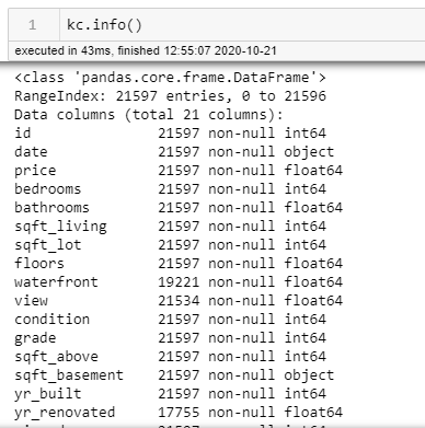
I've worked a lot in excel and more recently in Python. In Python a quick .info() will tell you quite a bit - examples like data types and if nulls values exist.
Some things I like to keep in mind and address are below.
Missing / null values:
There's a choice to be made here - do you remove the missing values? If you fill them in, do you do so with the most common values? means? averages? There have been cases where tracking missing values have come in handy as well. (Think about a questionnaire where people don't answer because of a possible perceived negative association)
In Pandas, if you want to fill in the null values, you can use .fillna() For example, if the data is numeric and you want to fill all the missing data with zeros it would look like this:
df['column'].fillna(0, inplace=True)Data types:
What type of data you're looking at is something to consider. Identify your data type and ensure it will be the most useful in your analysis. Numbers can be numeric, or categorical, or date-time... getting them into the most useable format is important. I know in Tableau, setting geographic data accordingly can be a game-changer for visualizing data.
Sensitive Information:
What about if your data is sensitive in terms of privacy? If it will be stored somewhere that could compromise security, it might be necessary to clean or encode sensitive information.
Scaling:
Perhaps scaling the data might be necessary. This is when you assign all the values to map to a consistent scale. As an example, let's say 0-1 or 0-10. If you are comparing various items that are related and don't have the same values - assigning them to a scale helps to compare them.
Duplicates:
This is something that can impact the outcomes. Again, sometimes just noting the duplicates can be dealt with after further examining the data but it's good to be aware if they exist.
Outliers:
These for me fall into the same category as duplicates. They definitely could impact your analysis but it's good to look at your data in the examine step before removing them all together. I have several techniques for this, but one of my favorites is to find the z-score and remove them using a function I created. You can see it in this blog.
There are others - but for most of my projects, these are where I start.
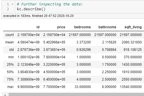
Examine the data:
This is my favorite part! Even above modeling, I think. I am naturally curious and this is the part where I look at things like looking at initial patterns. A couple of quick commands tell me a lot:
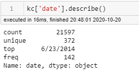
or if I want to look at one particular column:
Sometimes just counting the values for each column can be telling:
df.value_counts()
...and also visualizations! A picture is worth a thousand words.
A histogram or two can demonstrate how the data is distributed

and scatterplots can also show distribution, outliers, trends , can help identify categorical data as well ... or more:


I also like functions... if you're examining the same aspects repeatedly, a function can come in handy:
def check_column(df, col_name, n_unique=10):
    """Displays info on null values, datatype, unqiue values
    and displays .describe()

    Args:
        df (df): contains the columns
        col_name (str): name of the df column to show
        n_unique (int): Number of unique values top show.

    Return:
        fig, ax (Matplotlib Figure and Axes)
    """

    print('DataType:')
    print('\t',df[col_name].dtypes)

    num_nulls = df[col_name].isna().sum()
    print(f'Null Values Present = {num_nulls}')

    display(df[col_name].describe().round(3))

    print('\nValue Counts:')
    display(df[col_name].value_counts(n_unique))


    ## Add some EDA figures
    fig, ax = plt.subplots(ncols=2, figsize=(8,8));

    df[col_name].hist(ax=ax[0])
    ax[1].scatter(df[col_name], kc['price'])

    return fig,ax

#check_column(df,'condition')
This function makes it so you can quickly check each column:

You're getting the idea? This is the part that informs you about your data. If you're not a subject matter expert, you definitely begin to understand your data here. If you are a subject matter expert, you can look more deeply where you might theorize patterns might exist. Sometimes after examining the data, you might clean it more. Let's say that 90% of a column has the same value and you have some null values you might fill these values in with the most frequently used value.
From there, you can
Model your data
Modeling can come in many forms. Time series, linear and logistic regression, classification, AI, cluster analysis... it all depends on what problem you're trying to solve. I talk about these more in-depth in my blogs that are highlighted. Modeling is just a way to identify trends and use those to demonstrate insight or predict future values.
Interpreting your data:
This is up to the analyst/data scientist. Running numbers through models can provide numeric values like the following that can inform the performance of a model.
coefficients in linear regressions demonstrate how one value affects another
an r-squared value shows the 'goodness of fit' for a line in a linear regression
a p-value can reveal how probable the result is due to chance
A z-score: There are tables for this. Basically, this number represents how many standard deviations you are away from the mean. The majority of the data is less than 3 standard deviations in either direction (values of up to +3 or -3)
There are more, but those are some of the basics and I don't want to go too far off on a tangent here...
As I mention all the time, I'm visual... visually interpreting the data is helpful to me as well, and makes it easier to identify trends, outcomes and perhaps begin to inform actionable items and help explain them to someone who might not be as into all those values that I introduce above.
Below is an example of a visual clustering technique called Latent Dirichelet Allocation used in natural language processing. Here words are grouped based on how they relate to each other to form clusteters. Upon examining the word frequency in each topic, the relevance of each is demonstrated.

and then further distilled to make things more simple

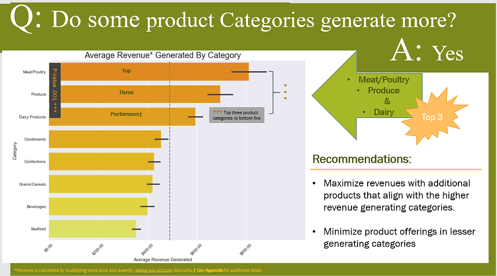
Or a good visualization can summarize and help make recommendations based on insight.
Interpretations depend on many things, and being able to convey those results depend on your audience.
At any rate, if I find myself in a project and am wondering if what I'm 'working on' is relevant? I check myself with the OSEMN method and it keeps me on track. What methods do you use?


Comments