Heatmaps are cool
- Andrea Osika
- Feb 6, 2021
- 3 min read


What's a heatmap you ask?
They visually represent the values in a table by using color scales. There's one at the bottom of this page. I'll tell you how I made one.
I'm working on a project to attract and hire candidates for a particular position. There are A LOT of candidates. To help qualify them, we send them a screening to assess their goals and one to assess their skills. Some of the candidates don't fill out the assessments so that filters some out. From there, we collect data on the candidates to help qualify the best ones. Each question on their goals and/or skill has a five-point ranking system. 0 indicated that they have zero experience or interest. 5 indicates they are a pro or are not interested. The candidates fall into several categories:
'Not Qualified' - have extensive experience in less than half of the skills
'Partially Qualified' - have extensive experience in about half of the skills
'Mostly Qualified' - have extensive experience in 75% of the skills
'Fully Qualified' - have extensive experience in 100% of the skills
I'll just focus on the skills for this particular case. We had 13 general skills that were outlined and assessed. There are very few that have extensive experience (5's) in 100% of the skills. Very few. Ok, zero. We had to focus on the 'Mostly Qualified' candidates. The team I'm working on wanted to better understand what skills might be scored or weighted in order to better identify and advance those candidates that had those skills. To inform the team, we were looking for a visual representation of the quantitative value for the experience level in each skill. Ahhhhh! Like a heatmap!
I imported the dataset:
#importing libraries and files
import pandas as pd
rdf = pd.read_csv('venture_responses.csv')
and dropped a few columns that were unnecessary (and contain personal data that shouldn't be publicly shared):
rdf.drop(['pipeline', 'email', 'candidateIds'], axis=1, inplace =True)
This gave me the data I wanted to work with... almost:
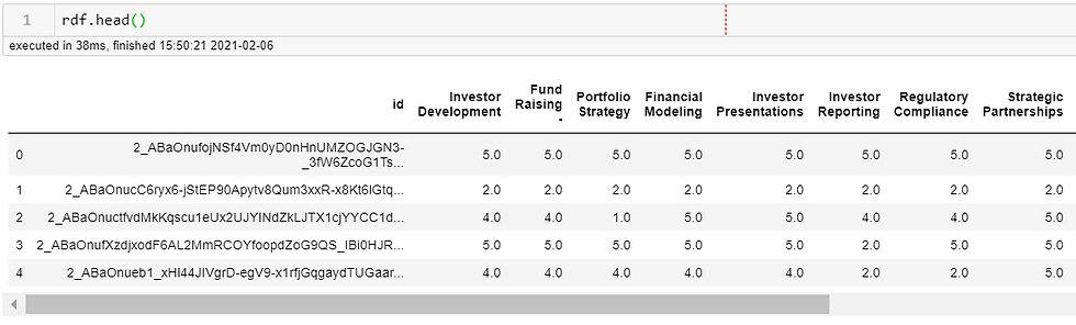
I had to drop that 'id' column, too or it would count the values for each of those... they are unique.. and wouldn't inform the goal.
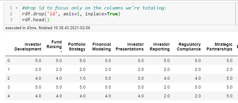
Perfect. Now, to total all the columns. To do this in pandas, you can get the .value_counts(). This can be applied to a column or to a whole data frame:
# create a dataframe of the counts for each column
counts = rdf.apply(pd.value_counts)
counts.fillna(0, inplace=True)
I then filled all the null values with 0. (line 2 above). By doing this, we are making the assumption that the candidates who didn't answer the assessment question have 0 years of experience. It's the most conservative estimate and assigns a quantitative value to each field for calculating the totals.
Let's have a look:
counts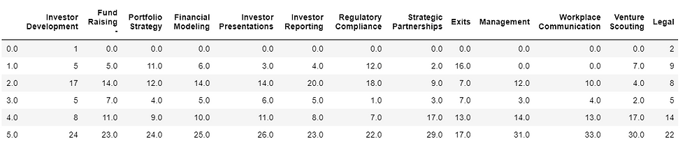
We really have all the data we need here. But it's black and white - wouldn't it be great if those fields that had the highest values were darker and those that had lower values were lighter?? Enter a heatmap!
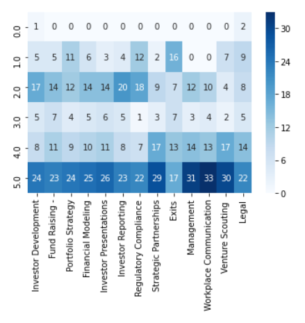
Pydata.org's Seaborn's library makes it so easy to visualize this, 1 line of code. Really!
#import seaborn and plot a heatmap:
import seaborn as sns
sns.heatmap(counts, annot=True, cmap='Blues')
I annotated to show the values and colored mine blue, since the org I'm consulting on uses this color scheme in its marketing materials. (I like to be on-brand :-) ).
The result allows us to easily see that the majority of candidates had lots of experience in 'Workplace Communication' - more than half of them. This could inform us to weigh those questions 'lighter' since it's a more common skill. Less than a quarter of the candidates had experience with 'Exits'. For that skill, we could weigh those a little more since it's less frequent.
This was a pretty quick and simple way to effectively visualize how to display a visual representation of the quantitative value for the experience level in each skill. Heatmaps are pretty cool.


Comments