K-Nearest Neighbors and PCA for Visualizing Overlapping Classes: Exploratory Data Analysis
- Andrea Osika
- Mar 17, 2021
- 5 min read

Visualization is one of my favorite parts of analysis. It takes something that is complex and draws us a picture that can be worth a thousand words. In my case many many more 1,883,555 to be exact.
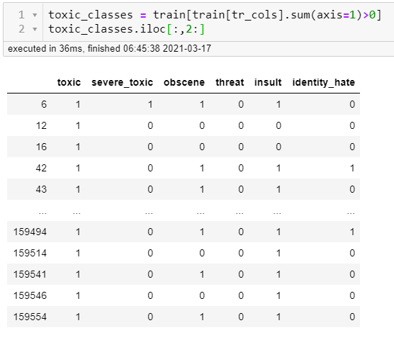
I had a classification project that I discovered had six classes that overlapped. It was text data that was classified as varying levels of toxicity. What this means is that the text could be classified as more than one of the six classes. So a comment could be both toxic and obscene for example. You can see in the table below where a '1' would indicate which class a comment belonged to happens to show up in more than one category:
This was a really tough problem to solve. By visualizing things we can begin to better understand them and develop ways to solve the problems we come up against. For this project, I did a lot of that to answer preliminary questions:
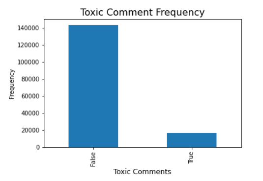
How much of the data was classified at all?
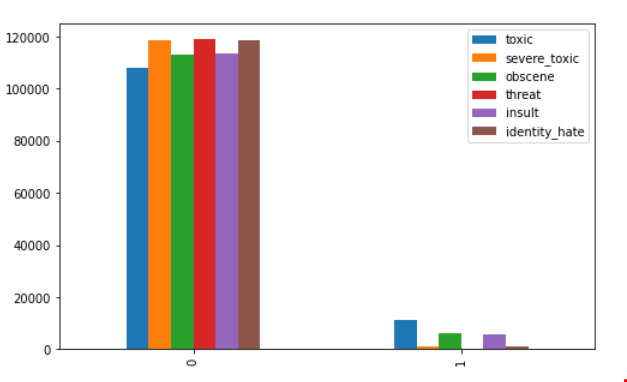
Of that which was classified, how was it broken down?
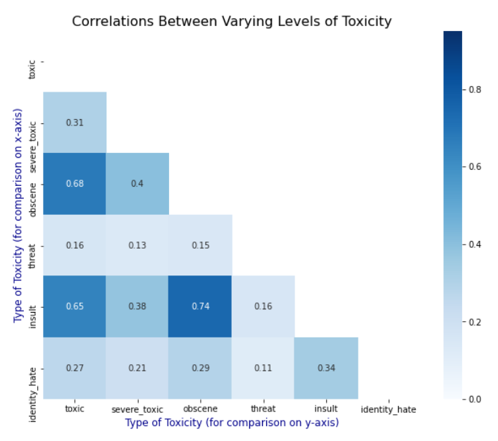
Were there correlations?
I ended up trying to apply one model that would attempt to classify all six types of comments. It did pretty well for the most part and I vowed to come back and dive deeper when given the chance. I had some time and the curiosity bubbled back up.
One thing I realized when looking back is that I never really visualized what the data could have looked like had it been grouped into six classes - even if they were overlapping. I wondered how it might help me further understand it in a way that could provide some additional insight.
This brings me to the rabbit hole I wanted to go down but hadn't yet:
What if I just grouped the data into six categories or groups? This would mean that I wouldn't necessarily have the labels already assigned for the text - it would be unsupervised learning. K-Means classification is one of the first algorithms I'd learned for unsupervised learning. It's an algorithm that classifies without having labels. You simply assign the number of groups and using a mathematical formula to find commonalities in the data. I'd learned about it after this project and thought I could revisit it to simplify things. There are ways to identify the most appropriate number of groups for this method, but I would just make the assumption that I had six classes based on how the data was collected.
As in all natural language processing NLP projects:
I preprocessed the text (my other blog on this subject goes deeper) by making it more uniform - making it all lowercase, removing punctuation and stopwords and assigned it a variable:
#preprocessing text
for text in train['comment_text']:
    clean_comment(text)

#assigning the variable
X = train['comment_text']
To make the text into something computer language can understand we vectorize it or turn it into numeric values:
from sklearn.feature_extraction.text import TfidfVectorizer
#another layer of removing stop words
vectorizer = TfidfVectorizer(stop_words='english')
x=vectorizer.fit_transform(X)
and from there, we can fit it into our KMeans model:
from sklearn.cluster import KMeans

NUMBER_OF_CLUSTERS = 6
km = KMeans(
    n_clusters=NUMBER_OF_CLUSTERS,
    init='k-means++',
    max_iter=500)
km.fit(x)
(this took around 40 mins for the record)
Once the model is fit on the data (learns the patterns) we use it to make predictions. This is where the clusters or groups are created:
# For every class we get its corresponding cluster
clusters = km.predict(x)
The result 'clusters' are the six groups each comment was assigned to.
Now to visualizing it.
I began to look around for ways to tackle this problem of how to visualize the output of this is since it's essentially blobs of numeric values. In other projects, I've used the actual text in other models to create word clouds, Latent Dirichlet Allocation, bar graphs, and other methods to extract sentiment analysis. The output of this model is numeric values which might not provide the sentiment, but help determine how to divide the groups or provide insight as to how data is distributed to inform what other models might best apply.
I wanted to see what these blobs looked like when we plotted them thinking back to when I was learning about cluster analysis. Like any other mortal analyst or data scientist, a trip to stack overflow was more than inspirational. I saw someone who did exactly what I was looking for and circled back to a technique that I spent a little time on and hadn't explored more deeply than what was required to complete a task. This is surprising since it's a pretty basic function of cluster analysis and provides a lot of insight. It's called Principal Component Analysis or PCA. If you go and read about it you can quickly become confused. The idea is that it looks for the biggest trends that explain variance in data and uses this to create 'principal components'. It takes these 'principal components' or biggest predictors of what classified something a certain way and assigns values to each.
from sklearn.decomposition import PCA

# We train the PCA on the dense version of the tf-idf.
pca = PCA(n_components=2)
two_dim = pca.fit_transform(x.todense())

# create the variables to plot based on the two primary principal
# components
scatter_x = two_dim[:, 0] # first principle component
scatter_y = two_dim[:, 1] # second principle component
Honestly, it took me a minute to unpack what's going on and why it was used. Let me explain how I understand it works:
Since we are trying to get x and y coordinates, we extract the top two principal components from our data to create our x and y values to plot. I had to break down each variable to understand how it was happening to be completely transparent. The simplest way to do this is to back it up and look at our original values. The variable x that we begin with is a byproduct of vectorization so looks like this:
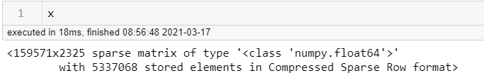
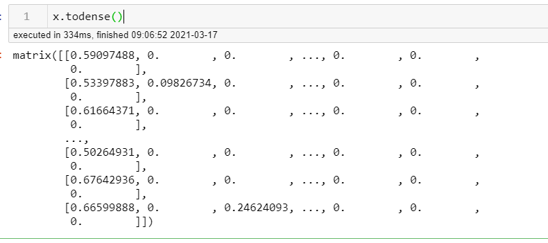
it's a sparse matrix - meaning a lot of what's in the matrix of data are zeros. In order to make it useable, we convert this to a two-dimensional object rather than 5337068 separate elements using .todense()
From there, PCA is able to calculate the two most important components for explaining categorization. We can use them and plot them against each other as x and y to visualize it:
import numpy as np
import matplotlib.pyplot as plt

plt.style.use('ggplot')

fig, ax = plt.subplots()
fig.set_size_inches(20,10)

# build a dict color map for NUMBER_OF_CLUSTERS we have
cmap = {0: 'green', 1: 'blue', 2: 'red', 3:'orange', 4:'cyan', 5: 'purple'}

# group by clusters and scatter plot every cluster
# with a color and a label
for group in np.unique(clusters):
    ix = np.where(clusters == group)
    ax.scatter(scatter_x[ix], scatter_y[ix], c=cmap[group], label=group)

ax.legend()
plt.xlabel("PCA 0")
plt.ylabel("PCA 1")
plt.show()
The result: A visualization of six overlapping groups
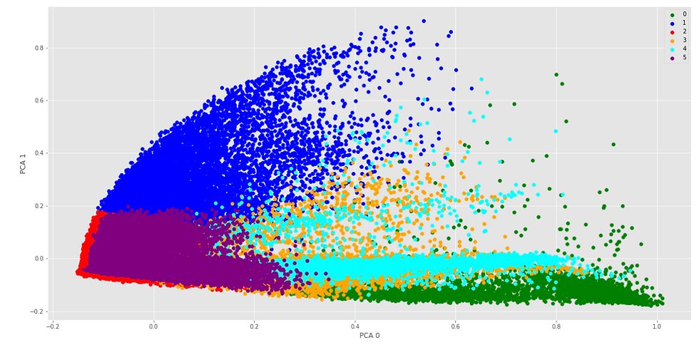
So this is what 1.8M words look like divided up into six groups based on mathematical similarity. Reminder: This is not an exact classification. It's a visualization. It was derived from two unsupervised algorithms. It's a starting point. It would require additional analysis to derive implications - but it does provide insight into what 6 clusters might look like.
This 2-dimensional representation provides some insight. There are clearly patterns that develop. Do you see what I see?
Clusters 2 and 5 seem to be the most densely populated while three and 4 tend to be sparse. Clusters 0, 3, and 4 all seem to exhibit the same patterns of density towards the x axis with quite a range in outliers on the x-axis with 4 being the most exaggerated.
This is the foundational insight that exploratory data analysis can provide. It did show me an example of what I wanted to see. I'll use this as groundwork for the future work of this project and am happy to have had the opportunity to circle back and answer the question I had.
This led me to other questions:
Could those clusters mimic what each classification might look like if singled out?
Could that inform a better way to classify those cases where there was not enough data to do so?
More rabbit holes. Perfect. I'll be here. In the rabbit hole.
Also:
Here's the StackOverflow page that I applied to my problem:
And some additional insight:


Comments