Tabelau: because, it's visual AND simple.
- Andrea Osika
- Dec 26, 2020
- 4 min read

EDA or exploratory data analysis is key to understanding a given dataset. Understanding each feature and how it relates to other features, identifying outliers and trends can all inform how best to use and model data .
For most of this past year, I've focused on using various packages in python including matplotlib, plotly, and seaborn to extract insight visually. Recently, I've seen demand for the use of tabelau as a skillset. I downloaded the package and began to explore a little to understand what the rage was all about. Now I know why people like it: It's simple.
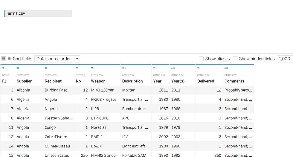
I was working on a dataset last week that involved arms trades from 1950 to 2019. I exported it to a .csv file to see if I could play a little with it. I connected to the dataset by clicking 'Data' from the upper left-hand corner and finding my .csv. I see that my cleaning paid off and the data loaded beautifully:
If I'd loaded the raw dataset from the .txt file it looks like did in its original state with null rows and columns off-set. There is a cool feature called Data Interpreter if data didn't load so great:
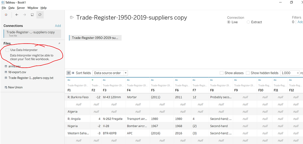
I've used it before on another project and it came in handy. It queries the data and sends an output table that can be opened externally ( I used excel ) with suggestions on how to make the data more useable. For this file, it was simply too wonky and threw an error.
From what I understand using Tableau as an ETL (Extract, Transform, Load) Pipeline on it's own is less than optimal. My guess is it's easier to manipulate data in python, excel, SQL or whatever server you have it in. However, you can connect to these various data sources which brings me to another reason I'm a fan:
Tableau has the ability to join and blend data. It basically mimics SQL on joining the data so if there's a common key, a table can be created using data from two tables of the same kind of source.
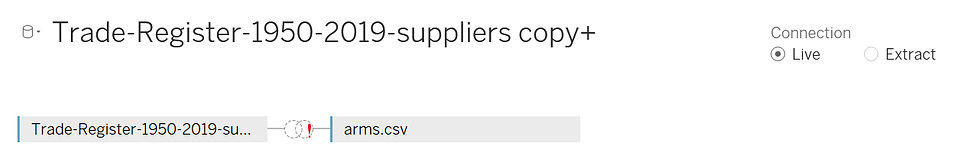
If data comes from two sources (the one above is .txt & .csv), or if the two data sources aren't equal in granularity, a blend can be used. An example of varying granularity would be that one data source tracks on a daily basis and one tracks monthly. If this was the case, a traditional join could theoretically cause duplicates.
Tableau allows this to happen on the fly by connecting to two data sources. Once you're in your table, click 'Data' and 'Edit Blend Relationships' and connect the two on their shared key, even if they're not named the same thing. In the case I'm using today, this isn't particularly useful but thought I'd point it out since I thought it slick in terms of useability.
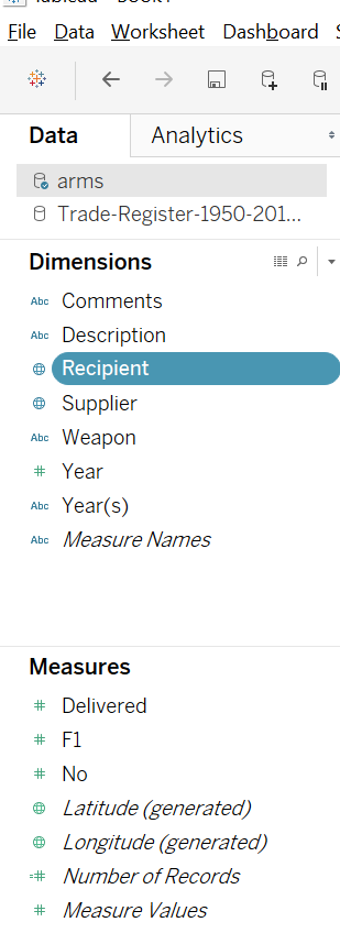
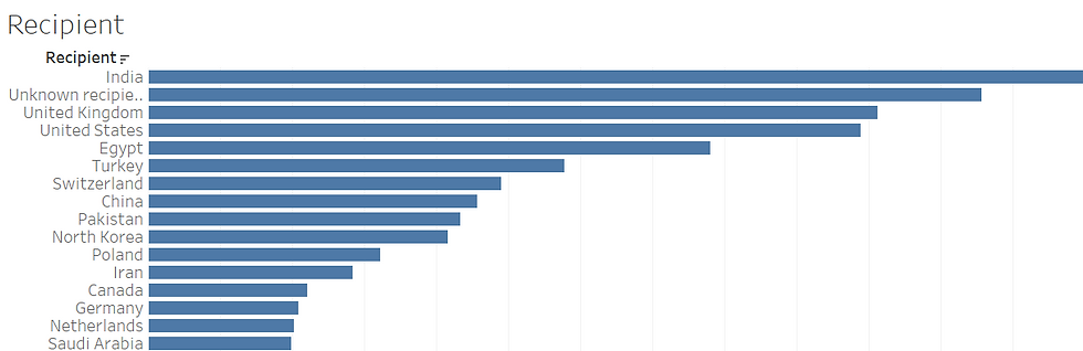
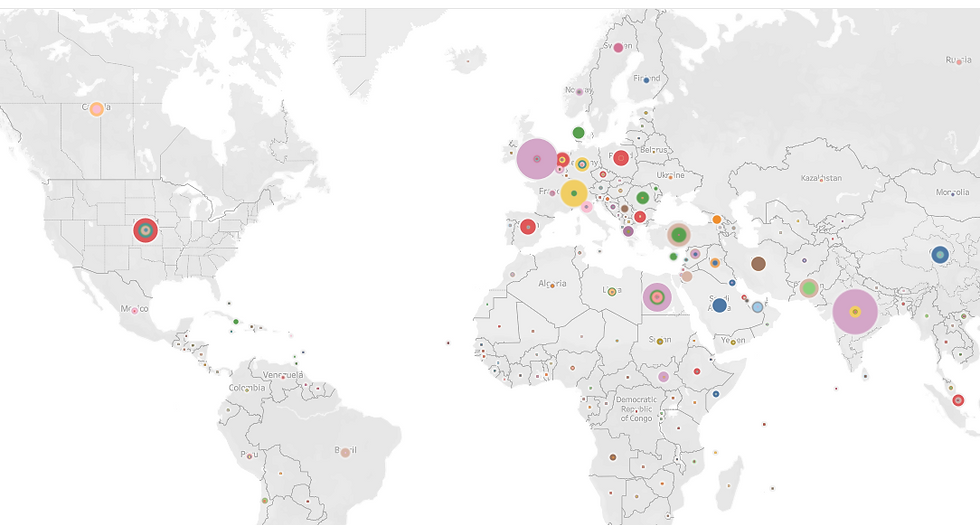
As far as useability, Tableau is pretty intuitive. When you open up a blank sheet, data is loaded into either a dimension or a measure, here you can help out a little by defining your data type. In the case of arms trading, Recipient and Supplier both refer to countries, and in the drop-down menu to the right of the highlighted bar like in the case of Recipient, it's easy to get Tableau to recognize it as such by selecting the Geographic Role and clicking on 'Country/Region'. There are many geographic roles - even airport codes. At any rate, with this assigned useability goes through the roof! Clicking the bar and dragging it onto the sheet, a map is populated with dots for each country represented. If we want to see who the biggest consumer of arms trades are, we drag the measure 'No' which is a count of arms onto the map. Tableau aggregates this per country and the dots change according to size:
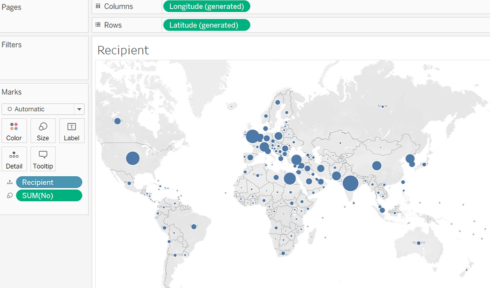
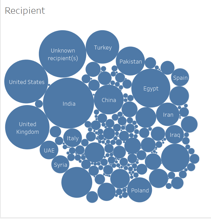
Here, you can quickly see who the main players are. What I thought was also interesting were how many were unknown. How? Since unknowns have no place on a map, packed bubbles show things in a way that's more interesting than a traditional bar graph:
What I like are all the suggestions that Tableau offers. In the upper right hand corner, you can see in the Show Me menu: there are MANY different options:
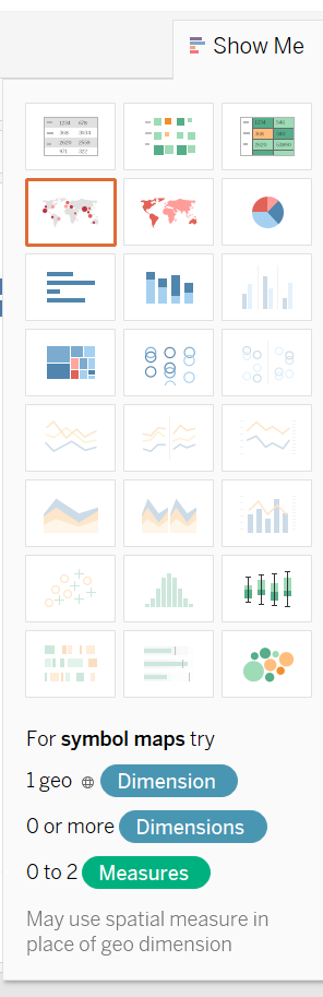
If you wanted to see that standard bar graph, you simply click on it, 'see it right below the symbol map that's highlighted here? One click, I get a bar graph, another click, it sorts it:
But now to see who bought what? To do this, I drag 'Supplier' into the center of a new worksheet, then 'Weapon' to track what weapons and again 'No' to aggregate the sum of these. Neat interactive visual:
Here, you can see who bought what weapon. Those pink ones are pretty popular in the middle east: When you click on the interactive sheet, MILAN is revealed and the number purchased by each country. By adding another layer of granularity, we can see who sold it to them.
Just these few features give you an idea how intuitive tableau is to work with. It adapts fairly easily to whatever data you throw at it and extracting insight is as easy as clicking and dragging. This is just the tip of the iceberg. After learning python and the libraries to extract this data, this is another way to quickly glean insight to better inform what to do with it next.
I'm sold! 'adding it to my toolbelt.


Comments