Have I mentioned I'm visual? Have you tried NetworkX?
- Andrea Osika
- Jan 8, 2021
- 6 min read

Updated: Jan 9, 2021
Showing how things are connected can get complicated, quickly. Sometimes drawing a picture helps.
An example:
Let's say I have a friend, Jen. And of course, Jen has friends. Mike, Nels, Alice, Micah, and Jay are their names. Mike and Nels are buds, but don't know Alice. Micah knows Jay and Alice and Nels. And I only know Jen. Reading this text is fairly straight forward but could you tell me who Alice and Jen know? Sometimes we need to keep track of things a little better we need to graph it out. What's more, is this can help to inform more than you might think.
In this case, graphs are composed of two primary objects: nodes and edges. Typically, nodes represent some entity such as a person, businesses, places, or webpages. Edges demonstrate the relationships between nodes. For example, you might have a graph of a social network like the very small one I describe above, in which each node represents a person, and each edge represents whether those two individuals are connected or friends within the network. I'll use NetworkX to help me visualize this:
#importing and instantiating networkx
import networkx as nx
G = nx.Graph()
Once we instantiate our (social) network, we can begin to populate it with nodes using .add_nodes():
#add people or nodes:
people = ['Jen', 'Mike', 'Nells', 'Alice', 'Micah', 'Jay']
for person in people:
    G.add_node(person)
Then we need to add our edges by creating a dictionary that keeps track of who knows who and iterate through it to pull it out sequentially and create edges:
#build a dictionary of relations - items represent who they know.
 relations = {'Jen': ['Mike', 'Nels', 'Alice', 'Micah', 'Jay', 'Andi'],
            'Mike': ['Nels'],
            'Micah': ['Alice', 'Jay', 'Nels']
            }
#iterate through they keys to pull out the relations:
for p1 in relations.keys():
#create variable that is a list of contacts for each indivual from the #keys in the relations dict:
    p2s = relations[p1]
    #iterate through and build edges for each of those variables:
    for p2 in p2s:
        G.add_edge(p1, p2)
and then let's see what we've got:
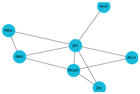
This clearly illustrates that I (Andi) only know Jen and how Jen knows everyone. You can see how many edges connect each contact. Micah is almost as popular as Jen. If you count the number of edges leading into her, you can see she has 4 edges or connections. Jen is clearly the most popular since she has 6. This concept of how connected a node is, is called connectedness. Also, we can easily answer the question posed earlier :
Q: Who do Jen and Alice know?
A: Jen knows all of us and Alice knows Micha and Jen, 'easy to answer with this graph.
We could use a more complex dataset since we know real life is a lot more complicated than this. Let's say some yelp reviews:
#load dataset
import pandas as pd
yr = pd.read_csv('Yelp_reviews.csv')
#import library and instanciate network
import networkx as nx
g = nx.Graph()
and
#quick look at the dataset:
yr.head()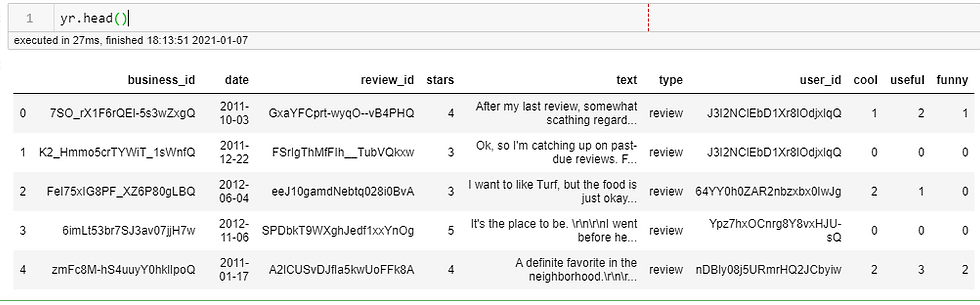
If we were to take a look at the relationship between the users and the businesses, we'd need to create nodes for each. Networks with multiple node types like this are called bimodal networks.
I'll go through the dataset and pull the unique values for users and businesses to create a node for each node type. I'll need to keep track of who's who so I create a list that maps the color to the appropriate node:
#creating an empty list to populate - I'll use this later
color_map = []
#finding the unique users and building the list for a color map
for user in yr['user_id'].unique():
    g.add_node(user, color='blue')
    color_map.append('blue')
#finding the unique users and building the list for a color map
for business in yr['business_id'].unique():
    g.add_node(business, color='green')
    color_map.append('green')
Here's where I add my edges for each interaction by iterating through the dataset:
for row in yr.index:
    user = yr['user_id'][row]
    biz = yr['business_id'][row]
    for u in yr['user_id'].unique():
        g.add_edge(user, biz)
and draw it using .draw():
%matplotlib inline
nx.draw(g, alpha=.7, with_labels=True, font_size=4, node_size=300, node_color=color_map)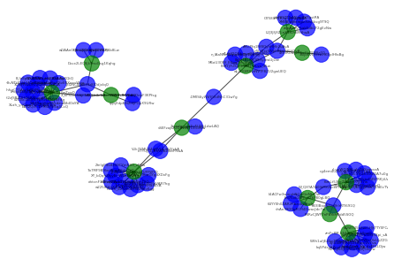
Here you can already see the customers who are represented in the blue and how they cross-pollinate so to speak at some establishments, but not others. Clusters start to show up. Visually, you gain a lot of insight.
There are other useful components that come with this. You can begin to find out paths and shortest paths throughout networks. If you begin to think about how this be applied to things like waze, or other maps and how the shortest distance between two nodes could be an incredibly useful metric. Nodes with the most connections could indicate significance (think social media and influencers).
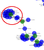
Back to the example. Let's pull out all the businesses again:
#creating a list of all the businesses:
b = []
for busi in yr['business_id'].unique():
    b.append(busi)

b
While these codes aren't telling, they represent individual businesses.
['7SO_rX1F6rQEl-5s3wZxgQ',
 'K2_Hmmo5crTYWiT_1sWnfQ',
 'FeI75xIG8PF_XZ6P80gLBQ',
 '6imLt53br7SJ3av07jjH7w',
 'zmFc8M-hS4uuyY0hklIpoQ',
 'PoRYjYUSjmeWM1WLsx_45w',
 'jJhNOhuGpIsJX5SEUFFWYQ',
 '4r9-iKOagzn5oUvPE9Bz4Q',
 'vSEFzop2GDXsIWTLxIGMiw',
 'L2J3JfjXZLnX1rLhWKthqA',
 'Dsvx2LEC8jk9nuGsg1Kqhg',
 'PdRzCJWP7nPdYoHPdd5SOQ']
The business I've highlighted is that node that's off in the corner. Look at all those customers and connectors.
To isolate this we can simply
g['jJhNOhuGpIsJX5SEUFFWYQ']which renders:
AtlasView({'V1k7XMUX4qHVUi-3IUYzhA': {}, 'w225lKHnX3jorkSXWgss0Q': {}, 'JffajLV-Dnn-eGYgdXDxFg': {}, 'ehtcnF3Ebvq23p107LcsuA': {}, 'q5nFaw9isjD_01PpVAR7hg': {}, 'XY_bQqhZfyyEi_W5n4kQNg': {}, 'ZmIgP4U4Ht9CYmNX0_zP6w': {}, 'clTYUJCL-rHnVIS2WePRwA': {}, 'P2vHl_ZzSzeu07W29KsKgg': {}, '7o7MF9B9lxcWupE8jiLOaQ': {}, '7zDqr2I0-xpw9HF5Ha54cA': {}, 'n4PmRYAvx2c6X0-fb9mT9Q': {}})This is a list of all that it's connected to.
another way you can see is if you just ask using nx.has_path()
nx.has_path(g,'jJhNOhuGpIsJX5SEUFFWYQ','V1k7XMUX4qHVUi-3IUYzhA')TrueThinking back to the shortest path... again, super easy with Netwrokx:
nx.shortest_path(g,'jJhNOhuGpIsJX5SEUFFWYQ','V1k7XMUX4qHVUi-3IUYzhA')#looks like they are directly connected here:
['jJhNOhuGpIsJX5SEUFFWYQ', 'V1k7XMUX4qHVUi-3IUYzhA']
So back to influencers... how would we find out how many edges exist between each node? Use .degree(). The node degree is the number of edges adjacent to the node. The weighted node degree is the sum of the edge weights for edges incident to that node.
To get all the degrees in a given graph:
g.degree()which renders this, all the nodes and the number of degrees, which is a lot to take in:
DegreeView({'J3I2NClEbD1Xr8lOdjxlqQ': 3, '64YY0h0ZAR2nbzxbx0IwJg': 1, 'Ypz7hxOCnrg8Y8vxHJU-sQ': 1, 'nDBly08j5URmrHQ2JCbyiw': 1, '8qSr4B1NJL99rlylewUjOw': 1, 'V1k7XMUX4qHVUi-3IUYzhA': 2, 'w225lKHnX3jorkSXWgss0Q': 1, 'JffajLV-Dnn-eGYgdXDxFg': 1, 'wLuDGMXytNVTF8ZU2gwUEQ': 1, 'X_kPh3nt0AJPNPHye2rTlA': 2, 'xkTbpCc-YhU8-EXZDA7u0g': 1, '3SIjo6vQIvxwHKEpIHfaBg': 1, 'APLIPfq1Rf8QyhHHk2uAyA': 2, 'SW5RpjVtyMhxdzuA8dOdYA': 1, '-OMlS6yWkYjVldNhC31wYg': 2, 'nSLrExcVVphiNzvSf5H7vA': 3, '-txH2zJSBZQHO6RWvoWXuQ': 1, 'yy8vNTtESId44OcGyaVnbw': 1, 'ehtcnF3Ebvq23p107LcsuA': 1, 'XMEBJp8mmpz3vsSkvg9T9Q': 1, 'tiyg_cQaPdUuSG95Xpi_sA': 1, 'd1zJj49Q5ikgvqQX0534RQ': 1, 'vhAn390OgR1H4DwacJdc7w': 1, 'Lmgv46LyI1PlLs0KNIfYFQ': 1, 'ryjqXdp68i2I9JPOpX9URw': 1, 'W_QXYA7A0IhMrvbckz7eVg': 2, 'clTYUJCL-rHnVIS2WePRwA': 2, 'k1ACFw3wmqkNGoiGeNLc0w': 1, 'fev0iI-XDrteD4SYRKjiUw': 1, 'cg4em4uXe5ab5qH7pB01gg': 1, 'XqU1PB0XWjcr3sUyZZGaWQ': 1, 'XLah_ynCwwYshCY9jc13tw': 1, 'q5nFaw9isjD_01PpVAR7hg': 1, 'B_leEp0XWSNi5_HQ_BLAAg': 1, 'n_lAaNGeWgspbbCJc0DqRg': 1, 'XY_bQqhZfyyEi_W5n4kQNg': 1, 'ZmIgP4U4Ht9CYmNX0_zP6w': 1, 'P2vHl_ZzSzeu07W29KsKgg': 1, '3ONPPazUH-Q3XblYJIaA1A': 1, 'NPoOEAPspruMOik-9sKQtQ': 1, 'sLuaWOJNALukrThYzqovzA': 1, 'm59OpbCyRwXSvERXeevWqg': 1, 'o33IBagNFxdJhIrRTl691Q': 4, 'hebXGQk5ggZSwTlUoEcTWQ': 1, 'tdoL4Un5_hy_rJxEFLLOjw': 1, 'zqnAdayPsak5dbLF2gEvNw': 1, 'W9h1ufjEzDp7THyAqRw65g': 1, 'jdeNI5TTTuM6mj3HTgstRA': 1, 'oRRHrcRPcEAnOepF3KPfsg': 1, 'M6oU3OBf_E6gqlfkLGlStQ': 1, 'bBS2Qsf--DYRXbYe5q4CcQ': 1, '2y3LWFfyRp02EdjwcVv7sw': 1, 'O758lrR1X2zI-ySeyjdr6A': 1, '7o7MF9B9lxcWupE8jiLOaQ': 1, 'OksbhhgC71Ary3zNHMypeQ': 1, '7zDqr2I0-xpw9HF5Ha54cA': 1, 'o2CGc1kQHEFkYOECM3NFdg': 1, 'ai2W745a8wrLHJr7TY0FCA': 1, 'kq5Pdsy8Znyh9KEkxWT_QA': 1, 'Cj6tGJrLEdN35H9cR6b8Lw': 1, 'wDAAn0HlnuZQnfga6CVIKQ': 1, 'n4PmRYAvx2c6X0-fb9mT9Q': 1, '2tyadgcxcaEu5LWgLdwLAQ': 1, '7SO_rX1F6rQEl-5s3wZxgQ': 14, 'K2_Hmmo5crTYWiT_1sWnfQ': 4, 'FeI75xIG8PF_XZ6P80gLBQ': 5, '6imLt53br7SJ3av07jjH7w': 8, 'zmFc8M-hS4uuyY0hklIpoQ': 9, 'PoRYjYUSjmeWM1WLsx_45w': 8, 'jJhNOhuGpIsJX5SEUFFWYQ': 12, '4r9-iKOagzn5oUvPE9Bz4Q': 2, 'vSEFzop2GDXsIWTLxIGMiw': 4, 'L2J3JfjXZLnX1rLhWKthqA': 6, 'Dsvx2LEC8jk9nuGsg1Kqhg': 3, 'PdRzCJWP7nPdYoHPdd5SOQ': 1})I highlighted the most connected node which has 14 connections. To get that in one line of code:
#create a dictionary of each degree, pull out the items and find the #max value:
max(dict(g.degree()).items(), key = lambda x : x[1])
which gives us this:
('7SO_rX1F6rQEl-5s3wZxgQ', 14)If you read and memorize each line in this blog, you'd know that was a business. I'd want to see what that was all about:
#create a database that has only data reflected in that business:
influencer = pd.DataFrame(yr[yr['business_id'] == '7SO_rX1F6rQEl-5s3wZxgQ'])
#isolate the text column:
influencer['text']
and it looks like overall, reviews look good but I'd have to get into NLP mode here to really find what people were saying:
0     After my last review, somewhat scathing regard...
14    The best gluten free pizza!! Absolutely loved ...
17    Given its location and surroundings (Postino's...
18    The Orange is a popular, well-reputed joint in...
25    Oooooh, I liked it, very much so!  Just sad th...
27    Wait a second...I have not written a review!  ...
38    I don't think I've ever been to this place whe...
40    i cant review restaurants in phx and leave out...
47    This place has exceptional food and pretty gre...
48    My friend has raved about this place for month...
50    Really good pizza has to be among the most per...
60    Delicious salad, pizza, and wine. We got the P...
66    I feel like an East Coast gangster when I roll...
68    I'm going to be an uptight stickler here, and ...
You can see once again that eda (exploratory data analysis) gets you thinking about how to look at data - or where to start digging!
I hope this inspires you to learn more. I can dig more into this tool and the algorithms associated if you want, just drop me a comment.
Also, there are MANY tools out there for visualizing relationships. I've worked with kumu.io and just did a search and found vso viewer. In addition to being visual, I love to learn about new ways to visualize data, and in the past year have picked up many new tools. Figuring out which tool to use to solve the problem is part of the fun, too.
Happy visualizing!


Comments