Bringing it all together in Tableau: Relationships, Joins, Unions, and Blending. Oh My!
- Andrea Osika
- Mar 5, 2021
- 5 min read

Tabelau is a very powerful tool used to analyze and visualize data. I've become a big fan. I like that for how powerful it is, it's relatively easy to use and interactive. The visualizations and dashboards that are the result of analysis are easy to understand and complex data can be further analyzed and digested with ease. This makes it attractive - especially if your audience is non-technical.
Getting the analysis to a state of a dashboard or visual begins with wrangling it or pulling it all together and cleaning it. If your data is all in one place - that's great. To get started, you'd simply import your .csv, query, excel, or other file and get to work on the cleaning and analysis by dragging and dropping into the canvas(es). However, if the data that's being analyzed exists in varying servers/locations and formats bringing it together requires some thought on what and how to join.
Since I'm a fan, I've worked with Tableau on a couple of projects knowing I'd want quick visuals. In a prior post, I focus more on the analysis side - I glaze over how to go about joining datasets. In this post, I want to take a deeper dive on how to do connect datasets - so here I am - being explicit about it.
In Tableau, there are currently 4 ways to bring data together or combine it. By using one of the following methods that Tableau offers:
Relationship
Join
Union
Blend
In previous versions of Tableau, connecting datasets happened on the physical layer. What this means is that whatever is connecting, did so by joining or merging data on common, related fields and resulted in a single flattened table for analysis.
This layer still exists, but now there's a higher level layer that's called a logical/semantic layer. This just offers more flexibility for combining schemas. The way I've heard it and seen it explained is like offering a container for the tables. Here the datasets can remain in their original state and still be related - just matching up where it logically makes sense.
I'll start off on how datasets connect at the highest level - or the logical layer:
Relationship
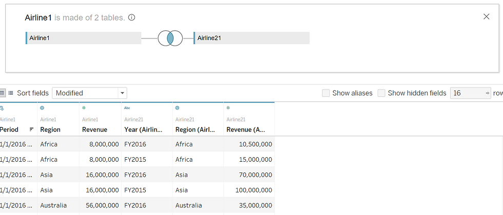
The beauty of a relationship in Tableau is that the tables involved remain at their original level of integrity and level of detail or granularity. You can retrieve them as needed for each sheet/query. I've also heard it referred to as 'noodling'. I think it's because of the 'noodle' that appears when you drag two or more datasets onto the relationship or logical canvas. It depends on what table you load first, as this is what's considered the 'root' table.
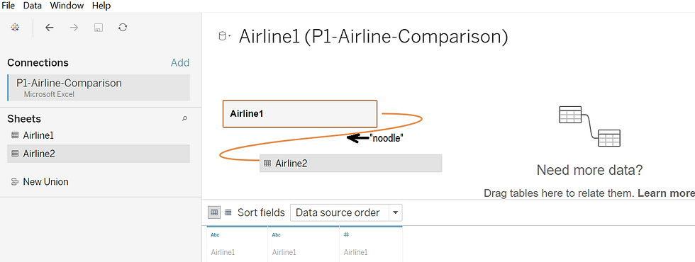
Once this happens, Tableau asks for how these tables are related based on matching records:
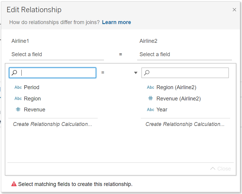
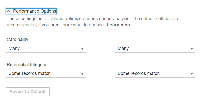
In this example, it's pretty apparent that we can connect on the regions... then you can begin to dive in deeper if you want to dial in how the cardinality rolls out.
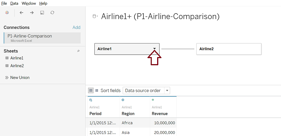
From there, we can easily visualize using the tables with the data intact for each. I ended up changing 'Period' from Airline 1 to match 'Year' in Airline 2 and making both date/time. You get the idea of how simple it is and how Tableau does most of the heavy lifting.
Join
As easy as relationships are (in Tableau!) and are becoming the default way to connect data, you might want to have more control over duplicates or other means of filtering... pulling ONLY what you want/need. Joining can happen anywhere in the flow of analysis and typically it's adding data horizontally in a table. To do this, you must open the data in the relationships canvas or the logical layer. Then, double-click this to get to the physical layer where joins can happen:
From there, you can join the tables. To get back to the logical layer, just click the 'X' in the upper right-hand of the box.
There are many kinds of joins. If you're familiar with SQL, it's relatively the same. I wrote about joins in this blog

An inner join only returns the data that overlaps both tables,
Left joins return all the data from the first table queried or the 'left' table
Right joins return the data in the second table queried or 'right' along with any overlapping data in the left table. These are very rarely used.
A full outer join returns all the data from both tables. If there is no data relating to a specific column, a null value is returned in that row.
If you want more documentation, you can click here.
Regardless - a join merges two data sources together to create a new table based on the criterion you set.
Union
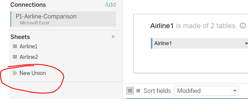
A union joins two tables by appending rows. Rather than building to the left and adding columns like in a join, you're building on what exists by adding new data in the rows. To do this means you'd need to have the same fields - meaning the same number, titles, and data types for each. Then just stack them on top of each other.
To get there, you'd click on New Union
and then decide if you wanted to manually add the tables or if you have an organized data system that updates, the wildcard might be helpful. Look at the difference:
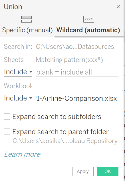
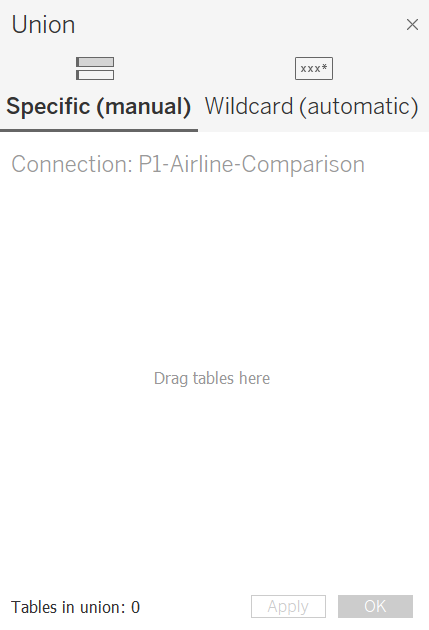
You can see on the Specific or manual on the left, it's drag and drop, then manually adjust things. On the right it's the Wildcard option - it's automatic and allows for recursion which is great but you'd need to make sure whatever is making its way in this path was clean and ready to be loaded.
Blend
What I like most about the blend is that it's flexible. Let's say you have data coming from a server like Snowflake and an excel spreadsheet derived from a google form. The world is an imperfect place and I've seen systems that are far wonkier than this. A blend is a solution for this. Blends allow for imperfection - the formats can be different, the fields don't need to be named the same and the level of granularity don't need to be the same - meaning if let's say you're looking at monthly data from one source and yearly or quarterly from another - no problem. Blend it.
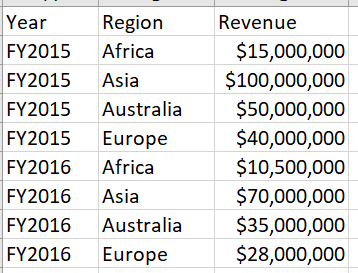
I don't have a super exciting example on hand .. I'll use the dataset I've been using this whole time - it's about airlines. If you look at the two sheets...
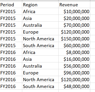
If you spend time squinting and reading, you can see that Airline 1 (left) serves more regions than Airline 2 (below). Also 'Period' and 'Year' are different:
The other beauty of blending... you can do it on the fly.
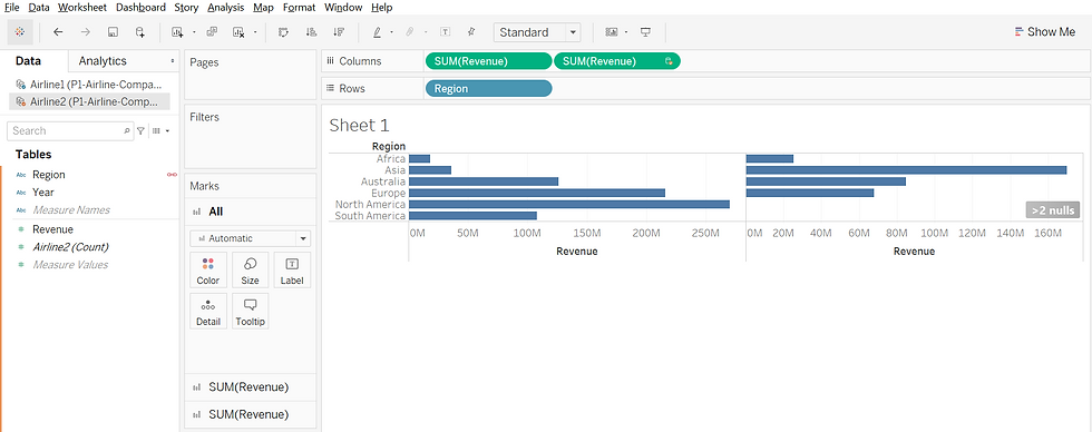
Like in the other examples: From the home button in the upper right-hand corner, I connect to the .csv file (called P1-Airline-Comparison). I repeat this same process again to simulate pulling from a separate data source. In a new sheet, I select Airline1 from the first file and Airline2 from the second. I aggregate Revenue using the SUM function from Airline1 in the columns and have each region represented in each row. When I click on the second dataset and begin to pull in Airline2's Revenue into the columns using the same aggregate function, I see an orange line on the left-hand side and an orange link next to Region. This is something that happens on the fly! It intuitively 'sees' the link and takes it from there.
Here we can build a quick visual that easily shows (and needs labeling -yikes) Airline 2 does better in Asia and doesn't even serve North or South America. I love visualization!
At any rate, the idea is that there are several ways to connect data in Tableau. Depending on what you are joining and how you'll use it will determine the best way to go about it.
If you're still wondering... just start in the logical layer and make a relationship. In my mind, it's the most flexible way and keeps the table integrity intact. And like even the best analyst or data scientist - review the documentation. A lot.


Comments